“Redefining Gift Giving”
|
It is time consuming and mentally draining to come up with appropriate and thoughtful gifts.
Keeping in mind that many people choose minimal lifestyles, tangible and mass produced items are often not preferred, so people would rather give and/or receive experiences, services, and locally sourced gifts. We were seeking insights into how people purchase gifts and the process people go through when trying to find a gift. We went into our problem space with the assumptions that gift giving is a stressful process, and that though people enjoy giving to and receiving from loved ones, those gifts can often be duplicate or unwanted items--this is usually the result of people not actually knowing what their loved ones want or need. |
Product:
Website Design My Role: User researcher Interaction designer Team: Judith Valzania Samantha Silverberg Joyee M. Ghosh Duration: 20 days |

For our initial problem statement, we sought to expand the definition of what a gift is. Our user research began with interviewing people who have given or received gifts. We found that overall, people find the gift-giving process to be stressful. However, our users also want to put thought into the gifts they get for others, and the value of experiences as gifts is higher than the value of physical items. When it comes to physical items though, our users believe buying local and handmade goods is better.
Our interviews ended up supporting and validating our initial assumptions, and that allowed us to move forward into the design phase with the following:
“How might we facilitate meaningful connections by expanding the definition of gifts beyond product based items?”
with this in mind we found following assumptions:
- People have a hard time finding unique gifts for their loved ones.
- People often give and receive unwanted/unused items that lead to unnecessary waste.
- People are conscious and prefer to shop local and ethically sourced gifts.
- People enjoy giving and receiving handmade and sustainable goods.

Research
Our user research began with interviewing people who have given or received gifts. We found that overall, people find the gift giving process to be stressful. However, our users also want to put thought into the gifts they get for others, and the value of experiences as gifts is higher than the value of physical items. When it comes to physical items though, our users believe buying local and handmade goods is better. Our interviews ended up supporting and validating our initial assumptions, and that allowed us to move forward into the design phase with the following:
"How might we facilitate meaningful connections by expanding the definition of gifts beyond product based items?"
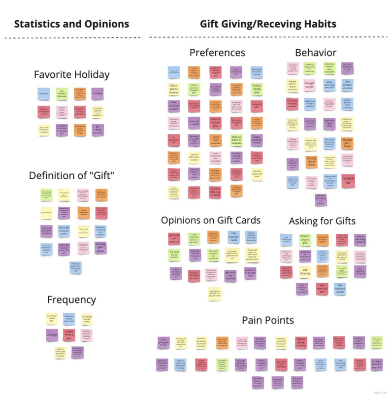
Once we completed all 7 of our interviews, we then began to synthesize their feedback, comments, opinions, and quotes into more manageable sections. This helped us visualize trends amongst users which will guide our research and decisions as we move forward then we grouped them into similar categories to visually see trends and patterns among the participant’s responses.
"How might we facilitate meaningful connections by expanding the definition of gifts beyond product based items?"
Once we completed all 7 of our interviews, we then began to synthesize their feedback, comments, opinions, and quotes into more manageable sections. This helped us visualize trends amongst users which will guide our research and decisions as we move forward then we grouped them into similar categories to visually see trends and patterns among the participant’s responses.
Through Affinity Mapping, we were able to break down common trends and opinions within the following categories:
1. Statistics and Opinions
- Favorite Holiday
- Definition of “Gift”
- Frequency
2. Gift Giving and Receiving Habits
- Preferences
- Behavior
- Opinions on Gift Cards
- Asking for Gifts
- Pain Points
3. Types of Gifts
- Sustainable/Locally Sourced/Handmade
- Experience/Quality Time
- Functional
1. Statistics and Opinions
- Favorite Holiday
- Definition of “Gift”
- Frequency
2. Gift Giving and Receiving Habits
- Preferences
- Behavior
- Opinions on Gift Cards
- Asking for Gifts
- Pain Points
3. Types of Gifts
- Sustainable/Locally Sourced/Handmade
- Experience/Quality Time
- Functional
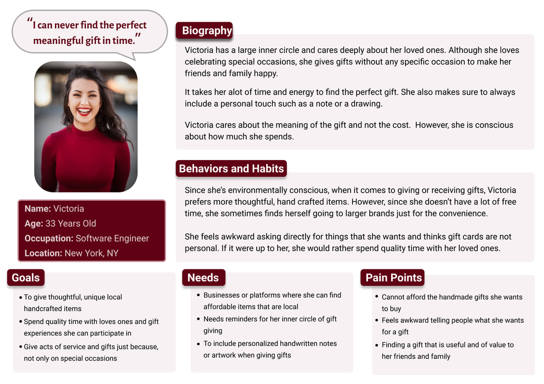
Persona
To summarize our project, we developed a persona. Victoria, is a target user of our platform, shaped based on insight we collected through our user research:
User Journey Map
The user journey visualizes the persona’s journey through the task that deals with the problem space. While creating a user journey, we kept the persona in mind to complete her goals as well as her emotional journey through the process:
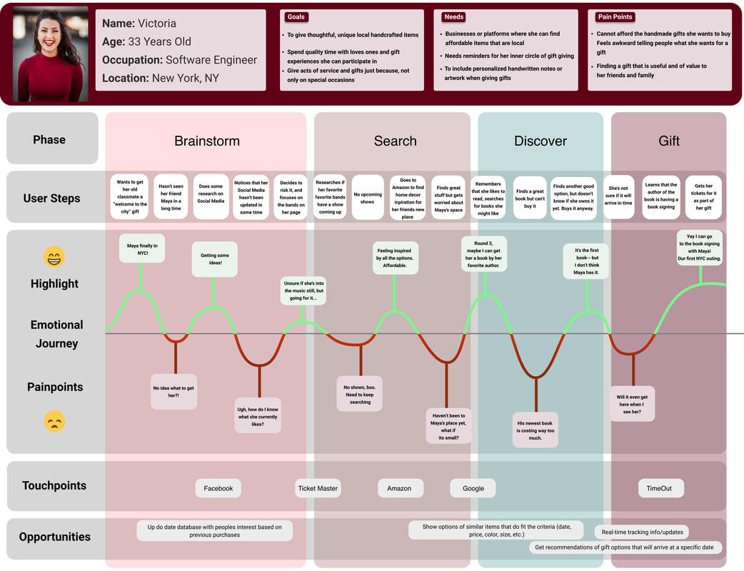
Because she had not seen her friend, Maya, in a long time, Victoria was initially confused and doubted whether her gift choices were appropriate for Maya during her search.
- Gift givers lack real time information about preferences and hobbies when searching for gifts.Victoria grew frustrated and spent a lot of time in the brainstorming and searching phases troubleshooting gift ideas for Maya.
- Gift givers often go through many rounds of mentally draining emotional highs and lows when researching and selecting a gift of meaning for someone.
- Victoria found a solution to her task by gifting her friend Maya with not only a book but gifting tickets to a book signing that she could go to with her.
- Users enjoy gifting experiences that they can also participate in.
"How Might We... create a space where gift-givers, like Victoria, and their personal network can communicate information to curate gifts beyond just products?"
Market Research
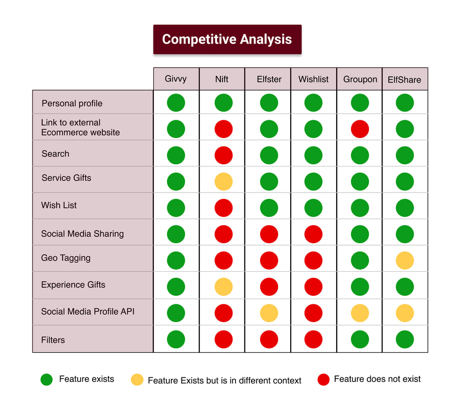
We conducted a competitive analysis to find the place of our product versus competitors, either those that are heavily leaned towards product outcome and those that offer services. We compared them based on how general or specific they offer their services or if it is product vs service based. Also we checked different features for each competitor versus our product.
Competitive Matrix
We conducted a competitive analysis to find the place of our product versus competitors, either those that are heavily leaned towards product outcome and those that offer services. We compared them based on how general or specific they offer their services or if it is product vs service based. Also we checked different features for each competitor versus our product.
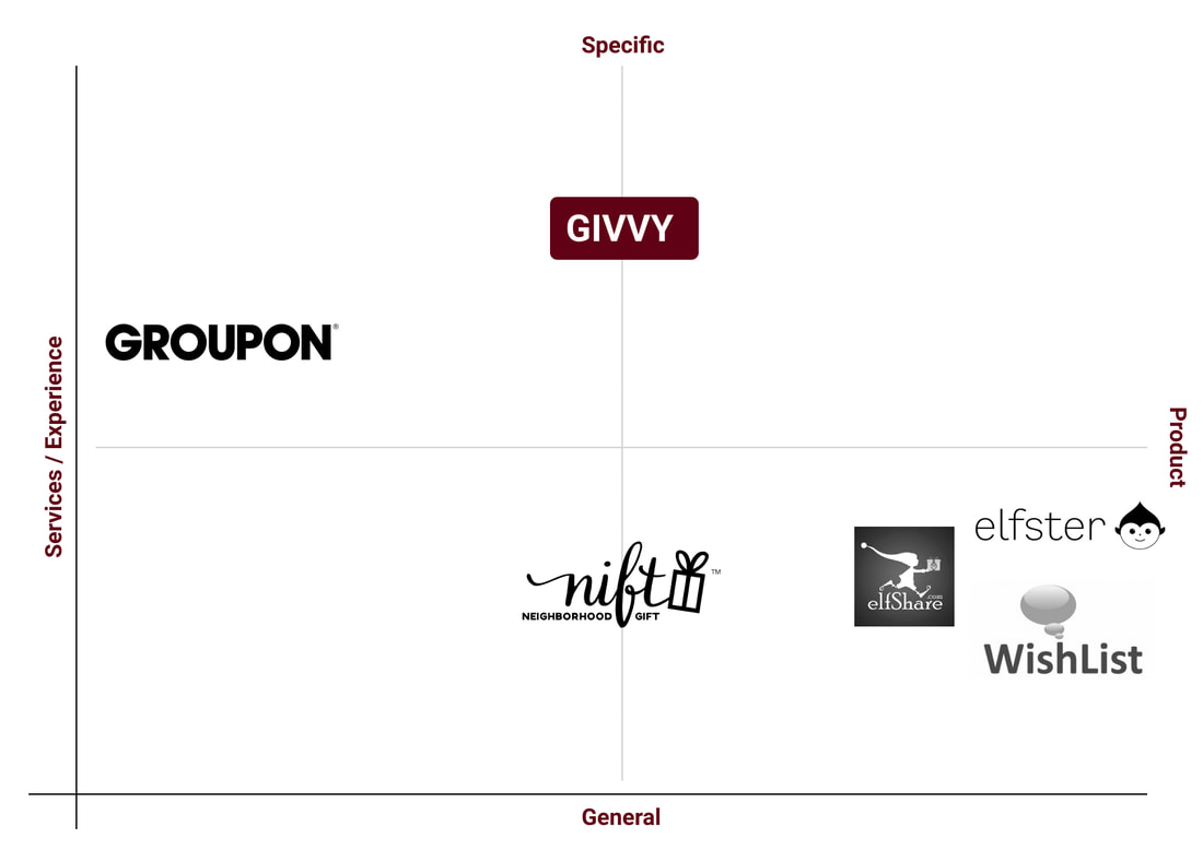
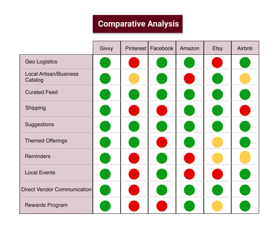
Competitive/Comparative Analysis
After seeing where our product, Givvy, fell within the market spectrum, we looked to see what other businesses in the same sphere are offering to their users. Our team employed a Competitive Feature Analysis to chart out what features these similar businesses (used also in the Competitive Matrix before) have in relation to the product we hoped to design. A Comparative feature analysis mapped out businesses that use the same business model as Givvy but are different in scope.
Insights
Competitive Analysis:
Comparative Analysis:
- Givvy was going to be sure to include the following feature used by our competitors: personal profiles, search and filters.
- Givvy looks to offer social media API, geo tagging and service gifts as some other competitors offered. However, it looks to offer experience gifts to distinguish itself.
- In the future, Givvy would consider building links to e-commerce websites, having wish lists and creating social media sharing capabilities.
Comparative Analysis:
- Givvy was going to be sure to include the following feature used by comparative business models: curated feeds, geo logistics, shipping and suggestions.
- Givvy looks to offer local artisan/business catalogs and local events and themed offerings as some other comparators offer. To distinguish itself from these other.
- businesses it hopes to offer reminders for social circles and themed offering based on recipient preferences.
- In the future, Givvy would consider building direct vendor communication and a rewards program.

Features & Design Studio
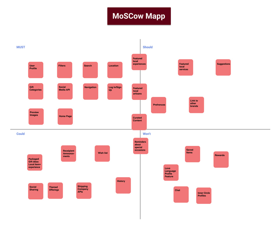
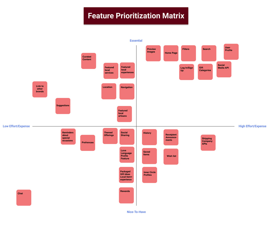
After reviewing our ideas and figuring out where our product falls on the industry spectrum, we moved into the design phase. Before putting pen to paper to sketch our ideas, we first needed to determine what exactly we wanted to incorporate into the site in terms of features based on the main tools that will be vital for searching and planning gifts. There are two methods weused to develop this: a MoSCoW Map and a Feature Prioritization Matrix.
Insights
Going into our first ideation of the design, the MoSCoW Map and Feature Prioritization Matrix
showed us that we need to focus on the following features for our initial design:
showed us that we need to focus on the following features for our initial design:
- User profile gift/brand preferences.
- Home/landing page (as well as other aspects central to a basic website).
- Search filters for users to select local and inexpensive alternatives to high-end products as well as local experiences and services.
Design Studio
To start designing our product we ran a design studio amongst our team. The ideation began with our persona, Victoria, her user journey and the insights we gained from our research as the catalyst. Our team knew we wanted to create a website as we had learned the practice of gift giving is a pre-planned, thoughtful act. The first and necessary prototype needed to be for a computer rather than a mobile device.
During design studio our team converged on a number of concepts for the following:
During design studio our team converged on a number of concepts for the following:
- Revolving registration screens for the sign up process.
- Sliding scales to input brand and gift preferences.
- Calendar views for shipment tracking, gifting dates and important occasions.
- Hero image and search bar on landing page.
- Friend circle announcements on landing page.
- Tabbed navigation bar.
- Displays for filters/suggestions/scrolls of local products, experience and services.
Product Principles
After working on the design studio and getting an idea of how we want to organize and segment our main features, our last step before building the first iteration of the website was to clearly establish what product/design principles we wanted to uphold.
The following is what we will be focusing on and carrying out through our design and motivations:
The following is what we will be focusing on and carrying out through our design and motivations:
- Pair individualized local products with unique local experiences.
- Expand the customer base for our local community businesses and artisans.
- Expand people's consciousness when it comes to consumer purchasing.
- Provide meaningful connections and memories.
- Reduce frustration and bring joy and excitement during the gift buying process.
Mid Fidelity Wireframe
Once we finished our initial sketches, we went into Figma to create a mid-fidelity prototype of our site for testing. We used the design tool Figma to create wireframes and prototype them into a clickable, bare bones version of the website. The clickable elements were made based on a set of tasks we determined our persona Victoria would follow in order to purchase a gift for her friend.
|
|
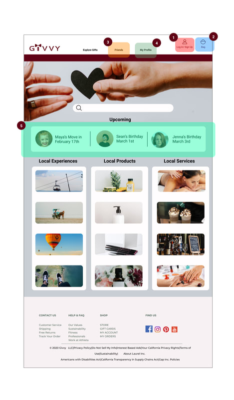
1: Landing Page. Here Victoria would click sign up or login to her account to access the latest trending gift items and view her friend list(2). The navigation bar takes her to pages where she can see her profile and calendar(3) for reminders of upcoming events. Upon clicking “Sign Up”, she would go through the process of setting up her profile (see 4-6).
2: Navigation Bar: Friends and Family. Here, Victoria can easily access her friend list to see who has a birthday coming up, or if any of them have any new life updates.
3: Navigation Bar: Calendar. Here, Victoria has a detailed calendar she can access to see updates on what is going on with her friends and their life events they have coming up.
4: Profile set-up. This is where Victoria selects her preferences about different types of gifts, and where she can choose to import her social media information to have her friend list and calendar of events update in real time.
|

|
5: Profile set-up (cont’d). Here, Victoria uses a sliding scale to indicate how she feels about certain categories of gifts (as a recipient).
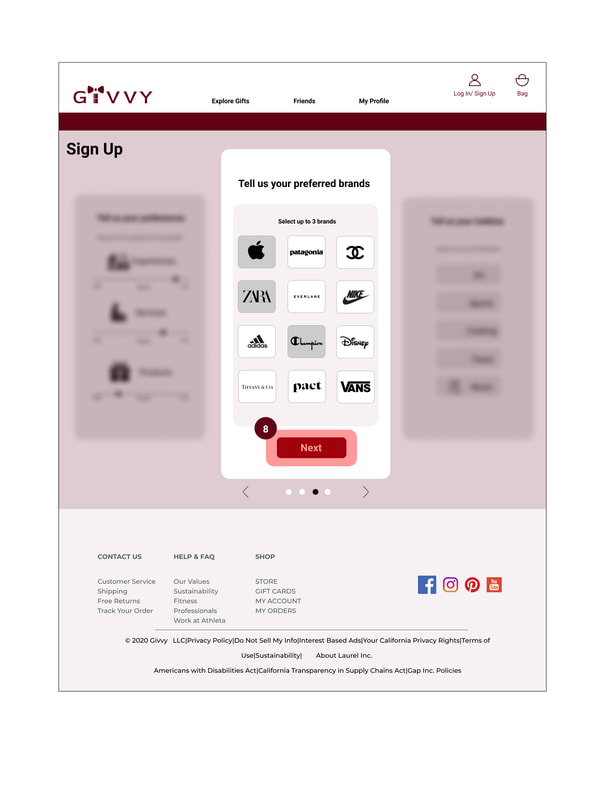
6: Profile set-up (finish). On this last part in the profile set-up, Victoria selects her favorite brands so that Givvy can provide suggestions to those who wish to get her a gift.
6: Profile set-up (finish). On this last part in the profile set-up, Victoria selects her favorite brands so that Givvy can provide suggestions to those who wish to get her a gift.

|
|
7: Here we see Victoria’s friend list, with Maya at the top. By clicking on her picture or name, Victoria can access her profile.
8: Maya’s Profile. Here we see a list of her favorite brands/stores, with Givvy’s suggestions for inexpensive alternatives below.
10: Maya’s Profile (cont’d). Here, we see Maya’s favorite experiences with Givvy’s suggestions. Victoria find a book signing event she can get tickets to for them both to attend.
|
|
9: Brand detail page. Here, after clicking on the brand from Maya’s profile, we see a store that offers equal options for Victoria to choose from for a gift within her budget.
11: View of gift bag: Once Victoria has selected her gifts, she is taken to this page to look over her selections. She clicks “check out” to finish the purchase.
11: View of gift bag: Once Victoria has selected her gifts, she is taken to this page to look over her selections. She clicks “check out” to finish the purchase.
|
|
12: Checkout confirmation: this window appears to confirm that Victoria’s gifts have been purchased, and when she clicks “done”, she is taken back to the rest of the site to check for arrival dates and anything else she needs.
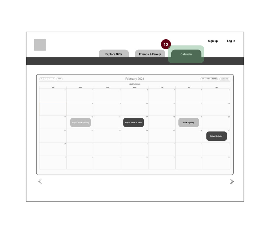
13: Calendar: shows the upcoming events and orders delivery dates.
13: Calendar: shows the upcoming events and orders delivery dates.
Insights
For this prototype we made our focus in three key areas:
- Home page--we created space for the hero image and primary navigation.
- Friend's Profile page--we created space for the friend's gift preferences and site’s local suggestions.
- Signup/login steps--we used sliding scales and revolving screens for the actions here.
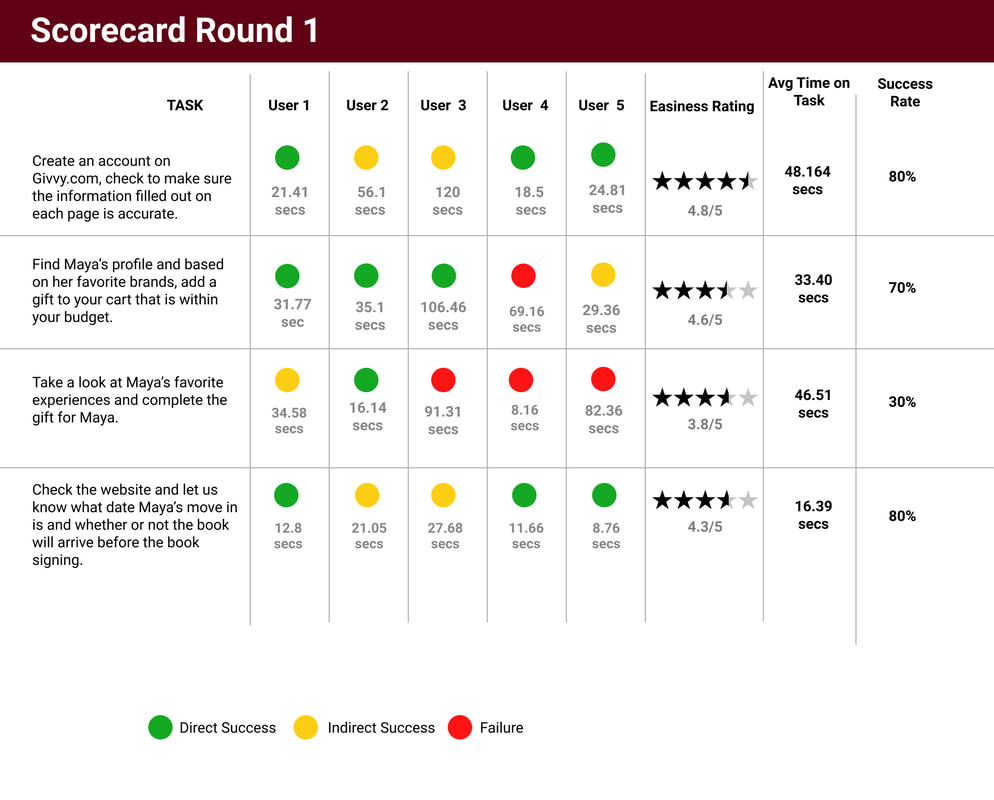
Usability Testing Round 1
To assess usability of the website, our team ran a series of task related questions on a group of five people once the prototype was completed. By having users try to complete these tasks with our product, we see what needs to be adjusted. Moreover it also began to give our team a sense of what was successful in the website and if it was overall solving the problem we started designing for.
Insights & Recommendations
- Friends and Family section on the home page was the first place users went to when asked to find a specific person, rather than the “Friends and Family” tab
- Action: Change the “Friends” box feature on the Home page to “Upcoming” to give users announcements as opportunities to give gifts. Rather than a confusing secondary pathway to the overall social circl
- Action: Make name and photo clickable.
- Most users had difficulty with “checkout” window and expected access to their cart after completion
- Action: Add “view cart” option to checkout popup and cart button to top nav bar
- Copy on various areas of the site made task completion difficult, particularly during profile
- sign-up and understanding differences between experience and product gifts.
- Action: Revise site copy
- Most users wanted to see the calendar feature as a part of their own profile page.
- Action: Relocating the calendar functionality from being an independent tab in the nav bar to becoming a section within the user’s profile.
- Within the Friends and Family section, most users had trouble understanding the layout and list view of the list members, it was difficult to navigate and find the people they were looking for.
- Action: Adding a search functionality within the Friends and Family tab for easy search of specific individuals, along with the capability to filter through members via important events, birthdays, location, etc.
High Fidelity Wireframe
Once our first round of testing was finished, we took our insights and reiterated our design into a more high level version, with added color and copy for the appearance of realism. For the higher level of fidelity, we added color, icons and more copy to give the appearance of realism. We also rearranged some elements to better replicate the appearance of an actual website. We reiterated our design based on the first round of usability testing in order to assess our improvements in the next round. Our goal is to improve the overall testing results.

|

|
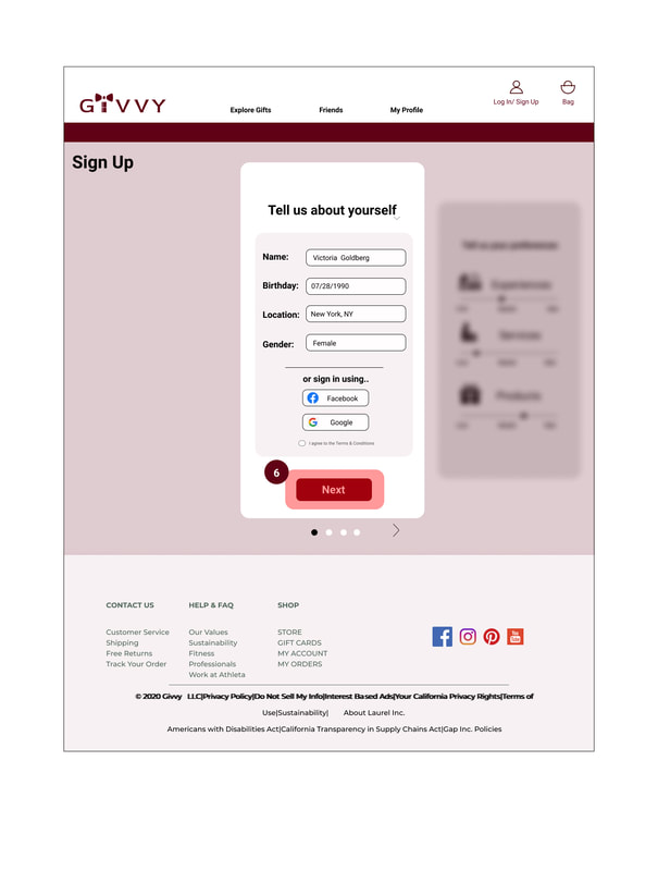
1: Login/signup: Victoria and other Givvy.com users would click here to begin creating an account.
2: Bag: Here gift-givers can see the gifts they have selected for purchase.
3: Friends: from the home page, users can access their list of friends on Givvy.com in the navigation bar.
4: My Profile: from the home page, once a user creates an account, they can access their profile page from the navigation bar.
5: Upcoming: on the home page, when a user is logged in, this bar shows what gifts/events they have coming up soon, a la a news feed.
6: Profile signup: here Victoria has entered in her information, and has the option of signing in via her social media accounts to import her friend lists

|
|
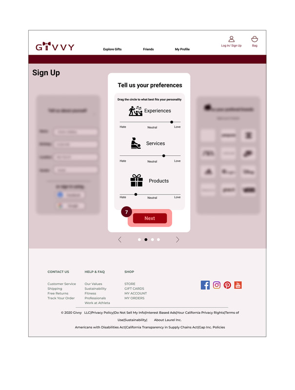
7: Profile signup: here Victoria has selected how she feels on a sliding scale about specific types of gifts, so her friends can see what she likes when they visit her profile
8: Profile signup: Here Victoria has selected some of her favorite brands to show on her profile, so Givvy can offer local alternatives to those of her friends that prefer to give her those items
8: Profile signup: Here Victoria has selected some of her favorite brands to show on her profile, so Givvy can offer local alternatives to those of her friends that prefer to give her those items
|

|
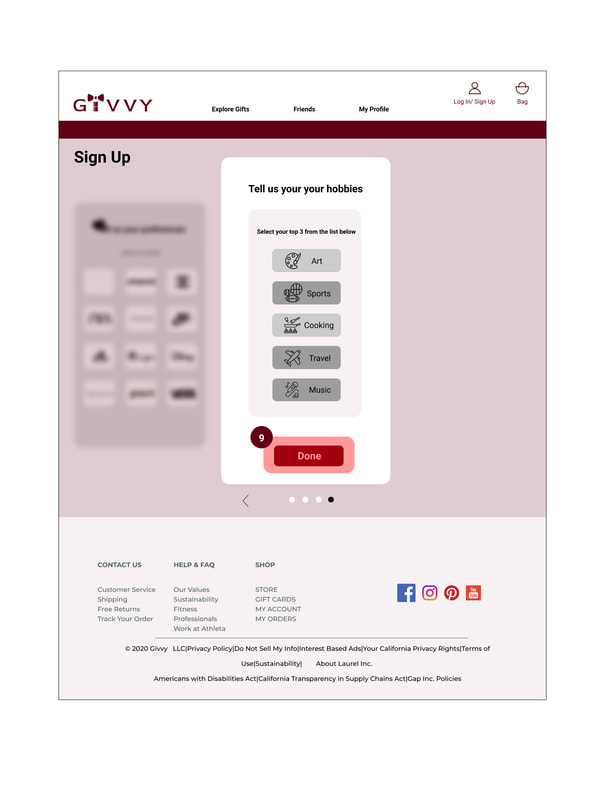
9: Profile signup: Here Victoria has chosen her favorite hobbies to further inform Givvy’s recommendations for gifts
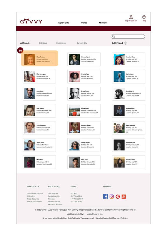
10: Friends page: Here is a list of Victoria’s friends. The first friend listed, Maya, is the one who has just moved to New York. Victoria selects her picture or name and is taken to Maya’s profile
10: Friends page: Here is a list of Victoria’s friends. The first friend listed, Maya, is the one who has just moved to New York. Victoria selects her picture or name and is taken to Maya’s profile
|
|
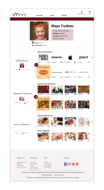
11: Maya’s profile: Here Victoria sees her friend’s profile, which outlines her favorite brands and other gift preferences. Victoria sees that Maya loves Barnes & Noble books, but the prices of books there is outside of Victoria’s budget. She then selects Givvy’s suggestion of The Strand Bookstore, which has books more within her price range
12: Maya’s profile: Victoria scrolls down the page to see what kind of experiences Maya likes, and sees a meet and greet with the cast of one of their favorite movies. The tickets to this event are very expensive, so Victoria sees Givvy’s suggestion of a book signing instead, and selects that as a complementary option to the book she just found.
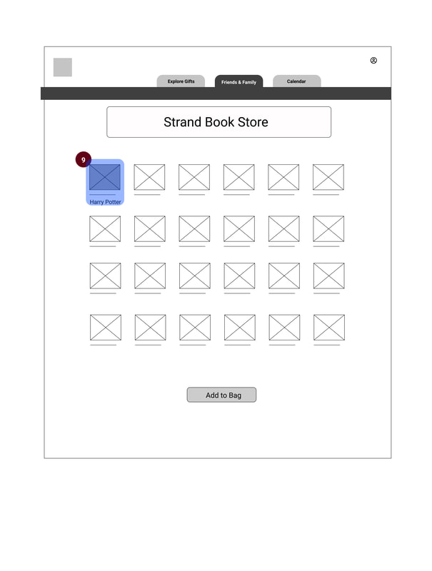
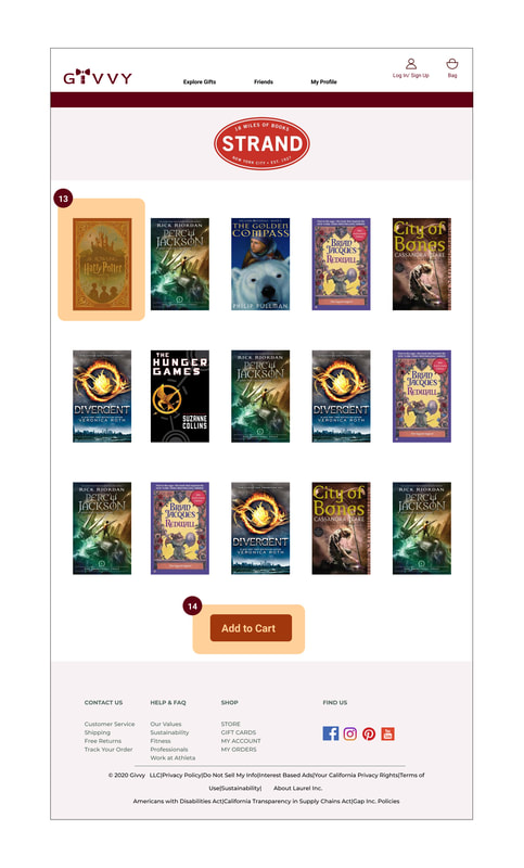
13: Brand detail page: On The Strand’s information page, Victoria sees their selection of Young Adult Fantasy books, which is Maya’s favorite genre. She knows how much Maya loves “Harry Potter”, so she selects the special edition as a gift.
14: Brand detail page: Once Victoria has made her selection, she clicks on “Add to Cart” to put the book into her cart.
12: Maya’s profile: Victoria scrolls down the page to see what kind of experiences Maya likes, and sees a meet and greet with the cast of one of their favorite movies. The tickets to this event are very expensive, so Victoria sees Givvy’s suggestion of a book signing instead, and selects that as a complementary option to the book she just found.
13: Brand detail page: On The Strand’s information page, Victoria sees their selection of Young Adult Fantasy books, which is Maya’s favorite genre. She knows how much Maya loves “Harry Potter”, so she selects the special edition as a gift.
14: Brand detail page: Once Victoria has made her selection, she clicks on “Add to Cart” to put the book into her cart.
|
|
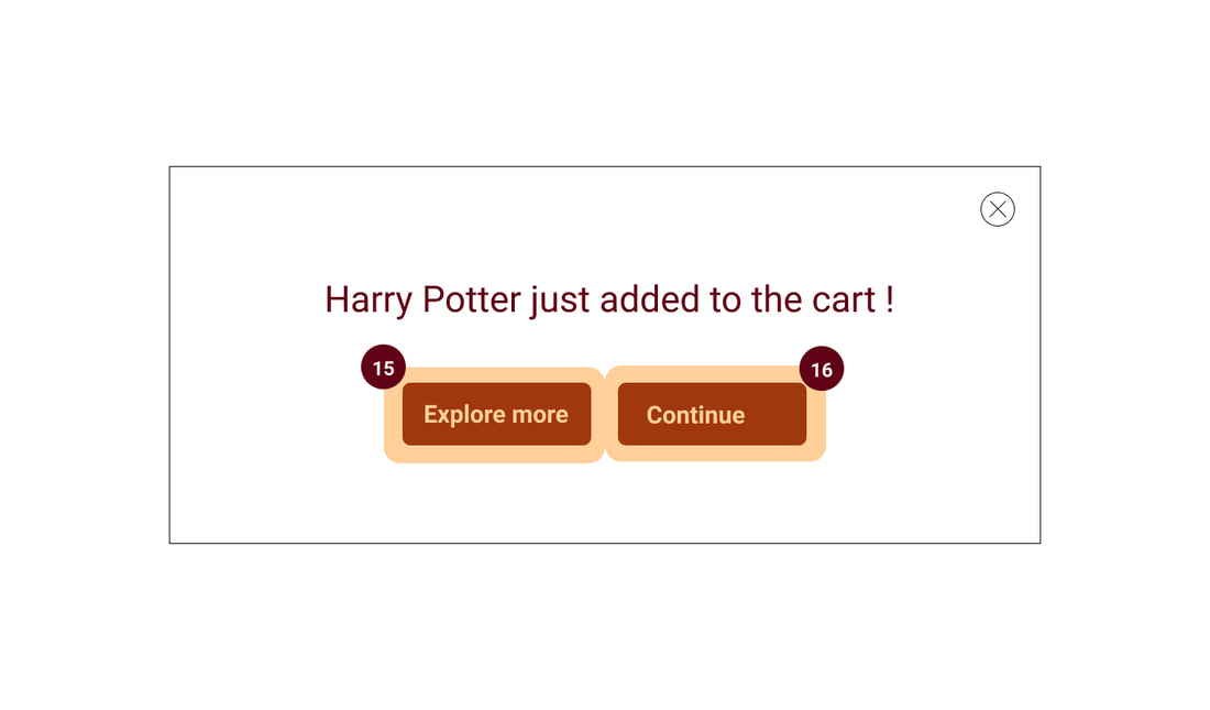
15: Checkout/cart popup: This window appears confirming that Victoria has added the book to her cart. She knows she wants to search for something else for Maya, so she selects
“Explore More” to find more options.
16: Checkout/cart popup: If Victoria was ready to complete her purchase, she would select “Continue” to go to her cart and check out.
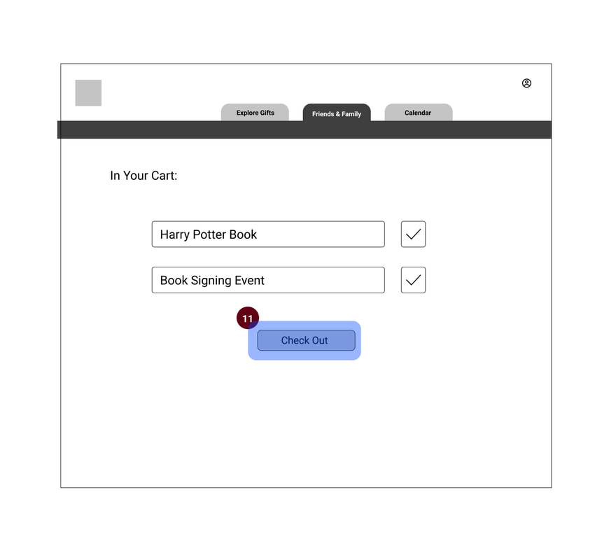
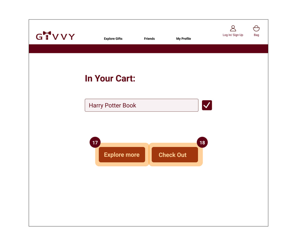
17: Cart view popup: Here Victoria sees what she already has in her cart. From here she can choose to go back and add more if she wants to make additional selections.
18: Cart view popup: When Victoria is ready to check out, she can click the “Check Out” button
“Explore More” to find more options.
16: Checkout/cart popup: If Victoria was ready to complete her purchase, she would select “Continue” to go to her cart and check out.
17: Cart view popup: Here Victoria sees what she already has in her cart. From here she can choose to go back and add more if she wants to make additional selections.
18: Cart view popup: When Victoria is ready to check out, she can click the “Check Out” button
|
|
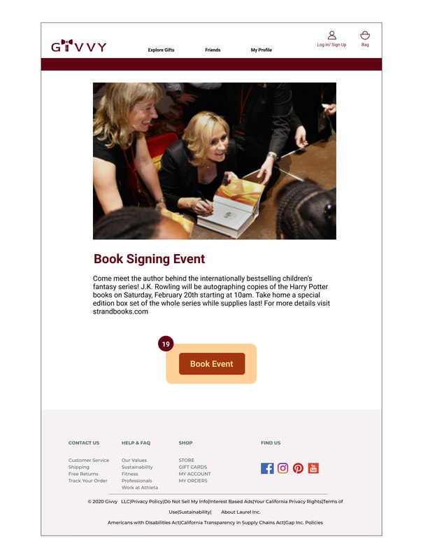
19: Event detail page: When Victoria sees on Maya’s profile that there is a book signing happening at The Strand, she selects that as a companion to the book. Here, she sees a description of the event and selects “Book Event” to add it to her Gift Bag.
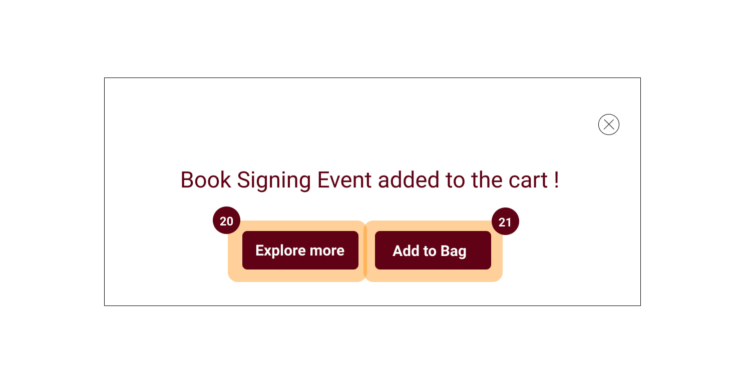
20: Checkout popup 2: Victoria now has a similar checkout screen where she can either move forward with her purchase, or explore more
21: Checkout popup 2: Victoria now has a similar checkout screen where she can either move forward with her purchase, or explore more
20: Checkout popup 2: Victoria now has a similar checkout screen where she can either move forward with her purchase, or explore more
21: Checkout popup 2: Victoria now has a similar checkout screen where she can either move forward with her purchase, or explore more
|
|
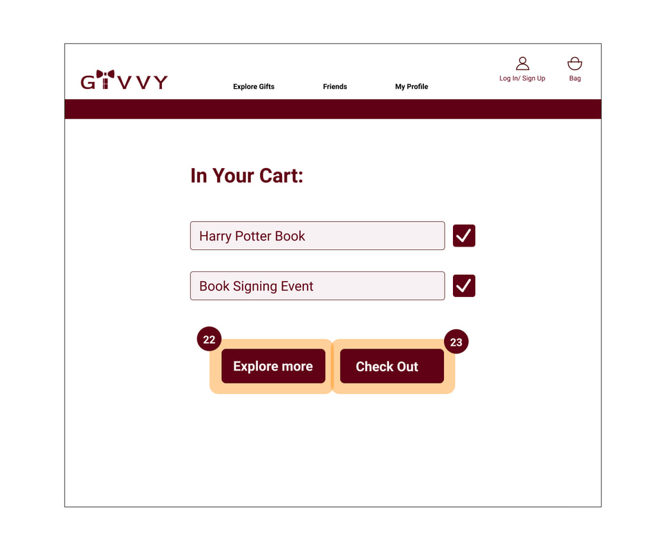
22: Cart popup 2: Here Victoria has a full view of everything she’s added to cart, and she can now check out or continue shopping
23: Cart popup 2: Here Victoria has a full view of everything she’s added to cart, and she can now check out or continue shopping
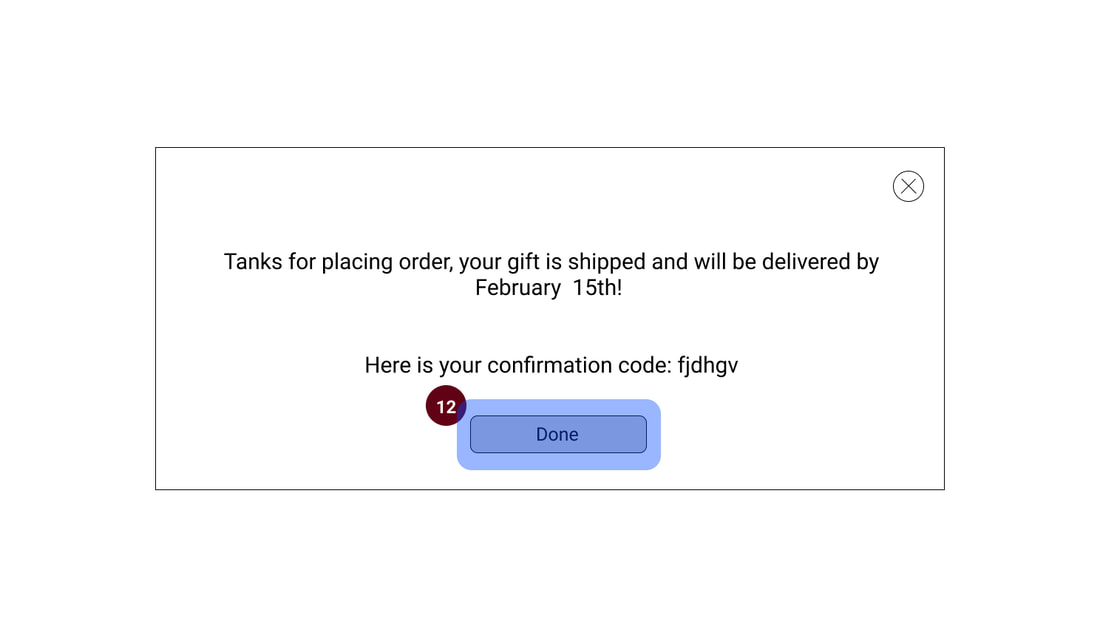
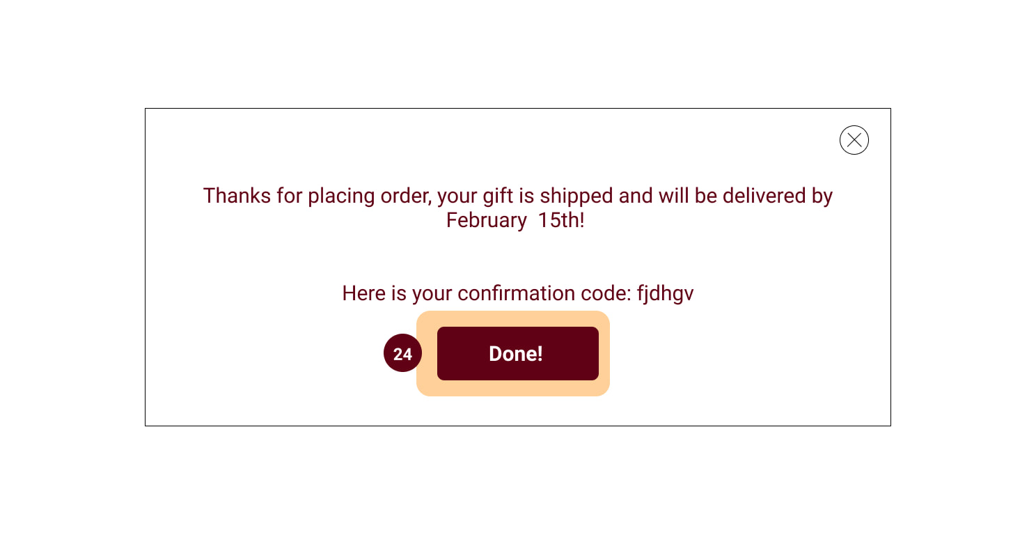
24: Confirmation: Once her purchase is complete, Victoria receives her confirmation that her order is complete, and she can now click “Done” to move to other areas of the site.
23: Cart popup 2: Here Victoria has a full view of everything she’s added to cart, and she can now check out or continue shopping
24: Confirmation: Once her purchase is complete, Victoria receives her confirmation that her order is complete, and she can now click “Done” to move to other areas of the site.
Insights
We were able to enhance the appearance of our prototype during this iteration, emphasizing the following features:
- Having the calendar accessible on the user's profile.
- Incorporating more refined copy, icons and images into the overall design for the appearance of realism.
- Adding more layers of personalization to the signup process to allow for the specificity present on a user's profile.

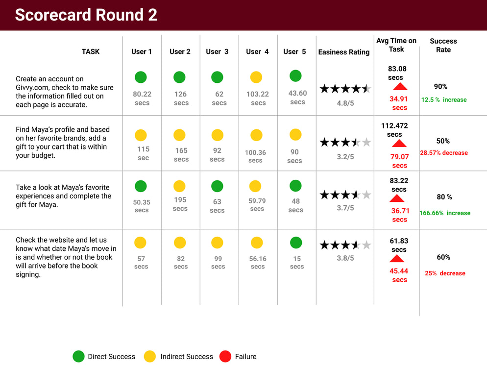
We conducted a second round of testing to measure the success of our changes in the high-
fidelity version of our site. We tested five people over the course of an evening, using the same tasks and scenarios from round 1. The tests were conducted via Zoom and we asked them to share their screen as they were navigating through the tasks so we could see their behavior, natural tendencies, and muscle memory, in addition to their verbal comments. This second round of testing is important to see how effective our changes were regarding completion of tasks. We also wanted to see how useful the overall site was for users and take the results into further iterations of the design.
fidelity version of our site. We tested five people over the course of an evening, using the same tasks and scenarios from round 1. The tests were conducted via Zoom and we asked them to share their screen as they were navigating through the tasks so we could see their behavior, natural tendencies, and muscle memory, in addition to their verbal comments. This second round of testing is important to see how effective our changes were regarding completion of tasks. We also wanted to see how useful the overall site was for users and take the results into further iterations of the design.
|
|
Insights and Recommendations
- When selecting an item to purchase, the selected item is not clear its actually selected (example: The Happy Potter book
- Action: Instead of graying out the selected item, adding a border or making it more obvious that it has been selected and added to cart.
- Maya’s profile seemed very busy and hard to look through, users had a hard time even remembering the task as soon as they got to her page.
- Action: Reevaluate the current hierarchy and segmentation of the categories to make it more digestible and action focused
- Most users took some time to understand where certain tools were, specifically the calendar, which leads us to understand that there is a somewhat steep learning curve for the website.
- Action: Evaluate the option of adding a short tool walk through/tour of the website’s functionalities to help users get the most out of the features.
- Almost all users expressed confusion on the copy and wording of certain sections, specifically in Maya’s profile and check out process.
- Action: Rewrite the text to more straightforward sentences.
- From the home page, it wasn't obvious what the website offered, there was no writing or “slogan” to base their assumptions on.
- Action: Adding Givvy’s value proposition/business statement potentially on top of the main hero image so users are reassured of how we can help them.
- Overall, all users expressed their interest in the tool, shared that they would most likely create an account due to the ease of the process and enjoyable questions, and see the value of using the website. This helps us understand that the need is there and now is a matter of refining the layout for a more seamless experience.
Google Heart Framework
When we finally launch our site, there will be certain metrics we'll need to measure to test how effective and useful our site is for users. The analytics method we will employ is the Google HEART Framework, testing several factors about the site.
The HEART Framework tests the following analytics:
• Happiness
• Engagement
• Adoption
• Retention
• Task Success
The HEART Framework tests the following analytics:
• Happiness
• Engagement
• Adoption
• Retention
• Task Success
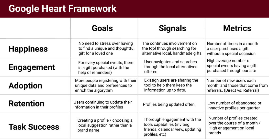
Insights
- Most of the analytics we want to test involve user retention and frequency of gift purchases. Our potential brand partners will want to know the level of engagement--the higher it is, the more refined our data will be for recommending products to users.
- If our task success and happiness metrics are high, we will be able to attract brand partners such as AirBnb and Etsy to our website. A customer base with a high number of profiles created over a month and users spontaneously buying gifts is hard to forgo. High engagement with local vendors will be a selling point of particular interest to these hopeful partners.
After the second round of usability testing, we understand that our design gave the users some challenges:
- The select item was not clear
- Maya’s Profile seems busy and hard to look at
- Hierarchies needs to be re-evaluated
- Position of the calendar needs to be changed some copies needs to be more straightforward
Next step
For the future step we recommend following steps:
- Running further usability testing on the high-fidelity prototype to make sure it's ready for launch.
- Once launched, a collection of the aforementioned analytics metrics will provide the information we need to go into the next iteration of the site.
- We need to Incorporate shipping company API's so users of the site can more easily track their orders
- We suggest to consider database integration of our recommended local stores for users.
- As more people engage with the platform, the functionality of the site will be refined in order to give more tailored content to users
