“Empowering people to make a difference on issues that matter”Motivote is a platform that wants to understand why so many people who are impacted by elections don’t consistently vote in them. Motivote believes that too much of the voting conversation focuses on “just do it” and “it matters” while glossing over the behavioral realities that cause drop-off. Humans are irrational. We don’t always do what we say we’ll do or act on what we think is important.
We considered “Voter” as our target audience and focused on the overall UI/UX of the voter dashboard. We concentrated on each page but gave special attention to the Actions page to provide more structure to the Actions list. Overall, we wanted to make the dashboard more delightful and intuitive to bring more engagement and excitement throughout elections. |
Product: Website re-design My Role: User researcher Interaction designer Team: Carolina Mendoza Melissa Palma Ouynh Nguyen Duration: 20 days |
Scope of the project
We considered “Voter” as our target audience and focused on the overall UI/UX of the voter dashboard. We concentrated on each page but gave special attention to the Actions page to provide more structure to the Actions list. Overall, we wanted to make the dashboard more delightful and intuitive to bring more engagement and excitement throughout elections.
We started off our research by analyzing everything about Motivote. The problem that we tried to solve was to make the dashboard more intuitive, social and fun by focusing on the UI/UX of that section.
We wanted to learn how the existing dashboard and teams currently engage. We would then leverage that information to fill in the gaps in areas that are necessary after conducting research. We hoped to find a solution for those voters who indeed want to motivate others throughout the voting process.We hypothesized that Young users want to go out and vote, but lack motivation to actually do so.
With this in mind, we made the following assumptions:
- Potential voters are motivated by their friends
- Potential voters lack information about what they’re voting for
- Potential voters are more motivated to do things when they can actively earn rewards
- Potential voters want to motivate and inform others to vote
- Peer pressure can lead younger generation (Millennial/gen Z) to encourage to vote
- Voting must be a delightful experience
- Awareness about the importance of voting is important
- Voters need intuitive platform to engage about voting
- Voters want to find a community in which they could exchange information.
Research
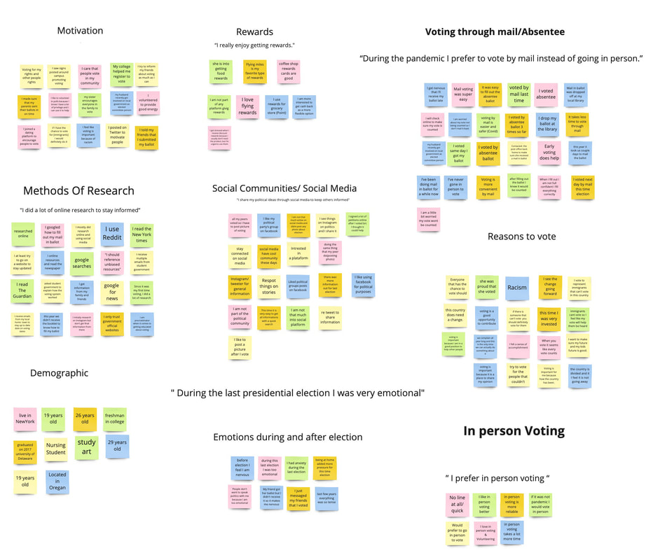
We began our process with conducting a survey to qualify candidates for our user interviews. By filtering through a survey, we were able to interview the targeted audience for our hypothesis. Being able to survey participants enables us to interview within an audience that we wanted to focus on relevant data and information. This prevents us from interviewing participants that would not have any use for our solution.After a screener survey, we conducted a user interview. Overview by creating questions that would help us understand the user's experience with the platform. After interviewing with 7 users, we wrote down quotes, behaviors, likes and dislikes from each interviewee.Then we grouped them into similar categories to visually see trends and patterns among the participant’s responses.
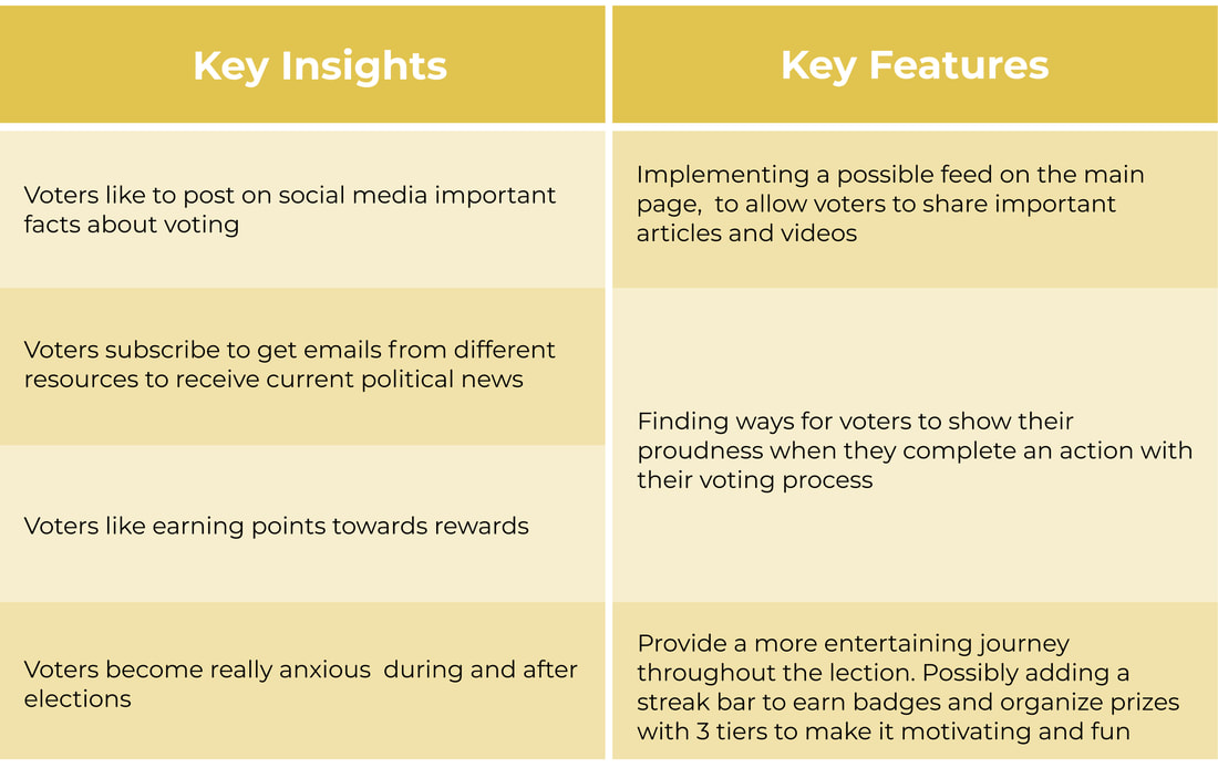
After synthesizing our affinity mapping we came away with these findings:
- Voters like to motivate friends and family to vote many different ways
- Voters like to post on social media important facts about voting
- Voters become really anxious during and after elections
- Voters find earning points very delightful
Persona
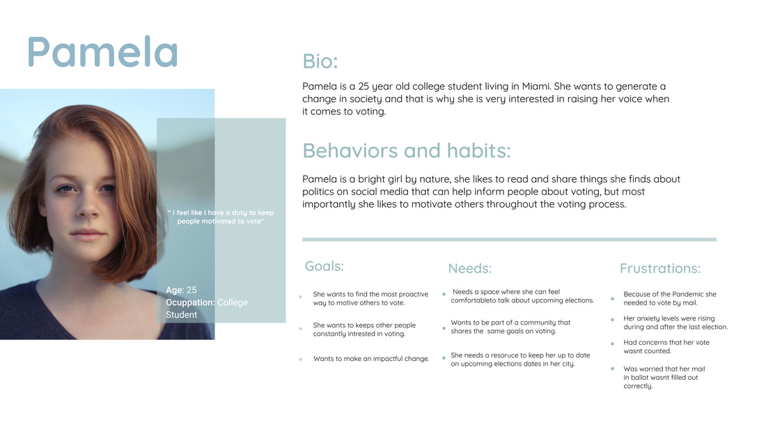
To summarize our project, we developed a persona. Palema, is a target user of our platform, shaped based on insight we collected through our user research:
User Journey
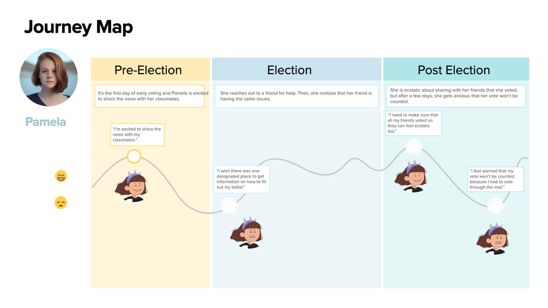
The user journey visualizes the persona’s journey through the task that deals with the problem space. While creating a user journey, we kept the persona in mind to complete her goals as well as her emotional journey through the process:
Our user research confirmed that Voting is one of the building blocks of a Democratic society. However, due to the stressful nature of elections, not everybody has the motivation to actually vote. As a result, Pamela feels that it is her duty to help motivate her friends and fellow students to go out and vote. Based these additional insights, we revised the scope of our project to the following:
"How might we help Pamela find ways to engage with her friends and motivate them to vote?"
"How might we help Pamela find ways to engage with her friends and motivate them to vote?"
Existing Website
Before getting to the design phase, we conducted a usability testing based on an existing website, we asked our voters to narrate their decisions and observed their body language while completing each task., then, we asked voters to rate the ease of usability.
Scenario
You’re a student of Miami Dade College. It’s time for the next election and you feel that it’s important for you to help motivate students at your campus to go out and vote.
Task 1: Check how many tasks your friend, Victoria Z., has completed towards their
voting plan.
Task 2: Get yourself ready to vote by choosing the way you will be voting in this
election.
Task 3: Let your friends know that you voted by sharing a selfie..
Task 4: Use your points to redeem a reward of your choosing.
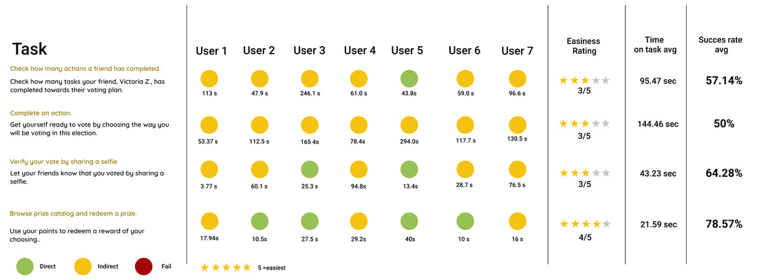
After reviewing our notes, we created a scorecard to see how our usability test compared among our different participants. It also helped us come up with clear takeaways and potential action steps for our next iteration.
Insights and recommendations
- Improve the search function on the search bar and allow voters to hover over people’s pictures to view a portion of their profile
- Change the layout of each task, have a shorter description and add illustrations to make it delightful. We also want to add a schedule to the actions, so instead of having a long list of tasks they can have daily tasks
- Possibly change the name of the category to “Gallery” to make it more intuitive. Adding more delightfulness to the page and add other uploaded pictures to make it fun
Ideation
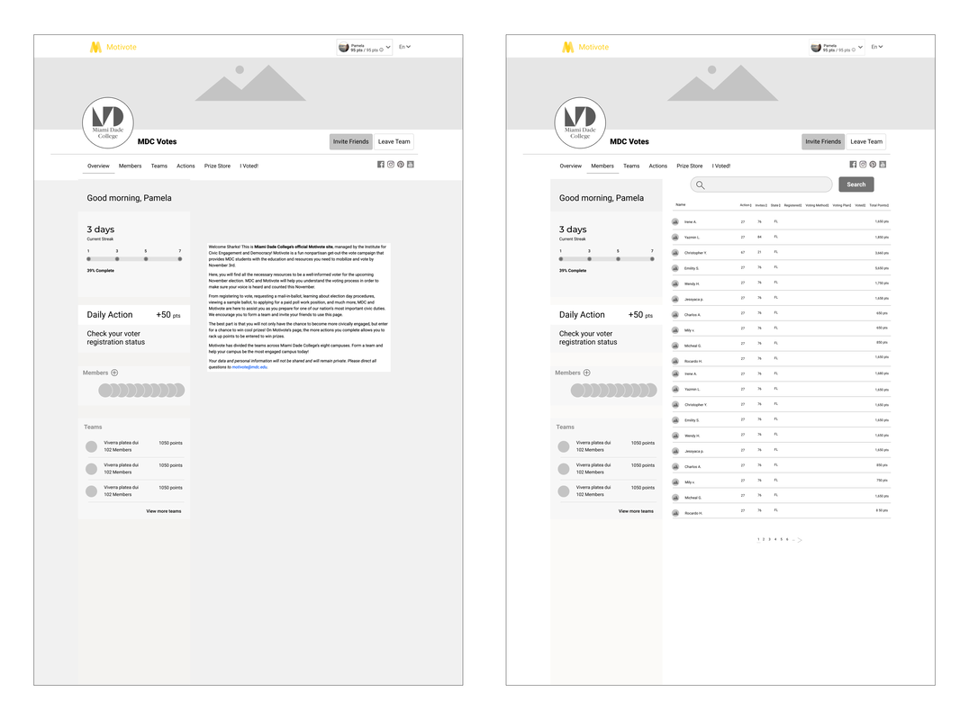
After the design studio, we move forward to building mid-fidelity wireframes. This gave us a more accurate view of our planned layout and the details around how things will work based on the insight into features we prioritized. These frames are some of the screens from the Mid-Fi Prototype that we made:
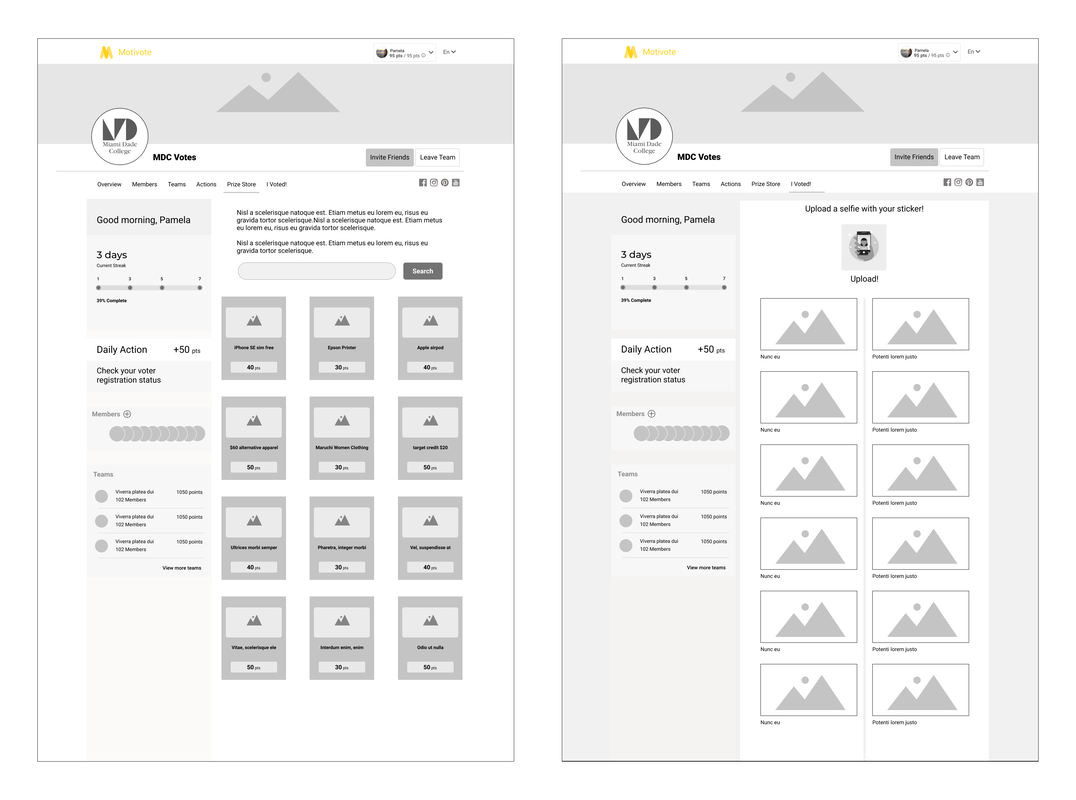 Mif-Fi Wireframe
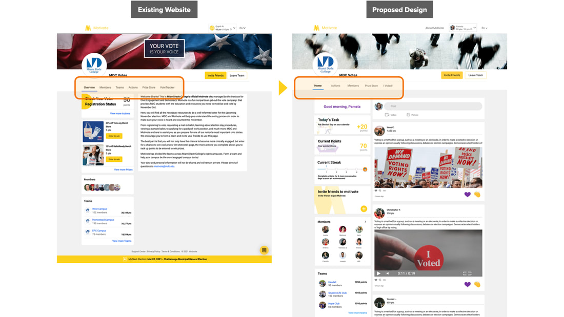
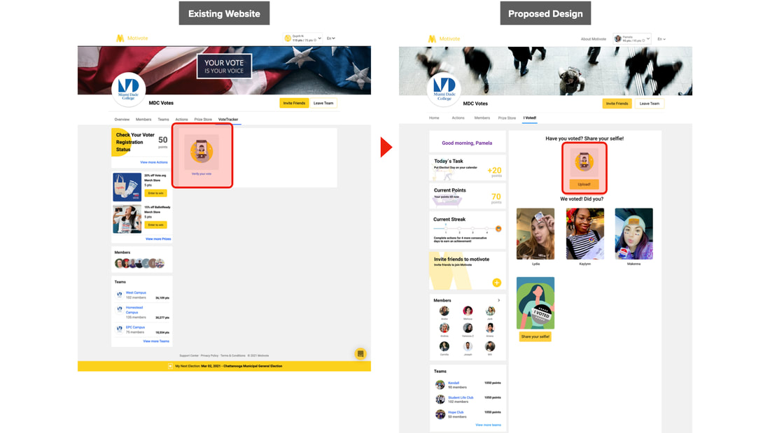
Next round we made a Hi-fidelity prototype based on the result of mif-fi usability testing. Here is a comparison between our proposed design with the existing website:
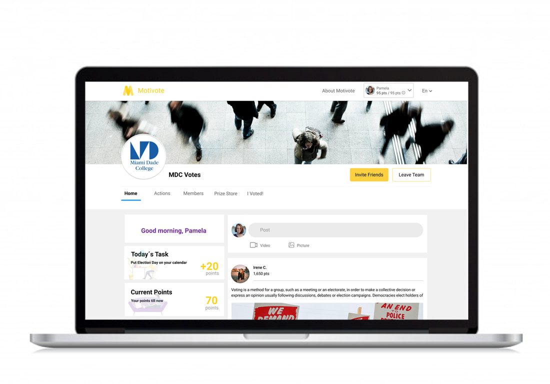
The very first problem that we realized during the usability testing was the main navigation bar, some categories did not make sense to users, for example during usability testing we realized that people were associating the “team” category and “members” the same, and it caused confusion. To facilitate the users experience throughout the dashboard we eliminated the teams page. Also, we changed the “Overview” category to “Home” because based of usability testing people were referring “overview page” as “home” so we found it was more intuitive for this page to be renamed it. In “Vote tracker” category where people upload a selfie to show their social accountability, there was no connection between uploading a selfie and name of category "Vote tracker" so we changed it to “I voted!” to bring a connection to uploading the selfie!
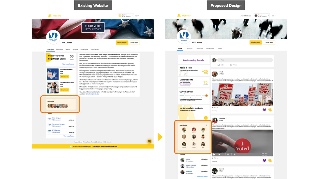
In the existing design “member section” was placed on the left side bar and was not interactive, we made it easy to recognize so voters can find the members page easier also voters can click on it and be directed to the members page.
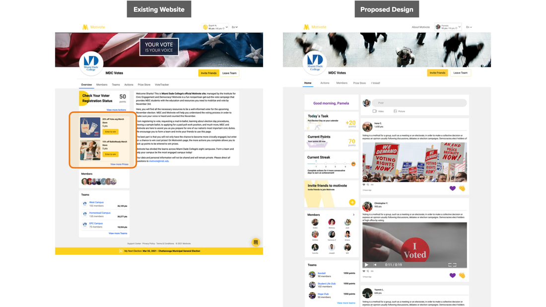
For most users the prize section was more like an advertisement so we moved that, instead we added the 3 new ways to engage to the platform
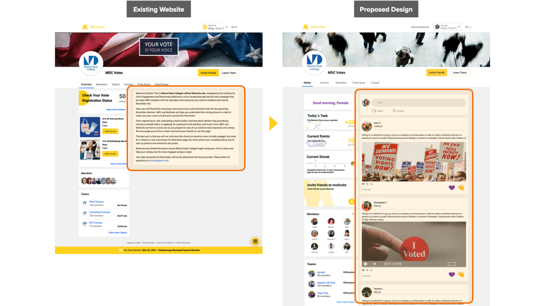
As you can see on this slide, the landing page has a hefty amount of text, which we changed it to the feed.
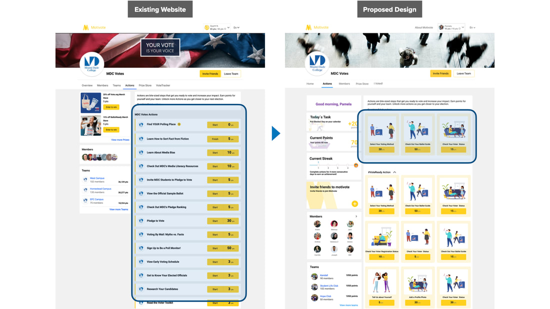
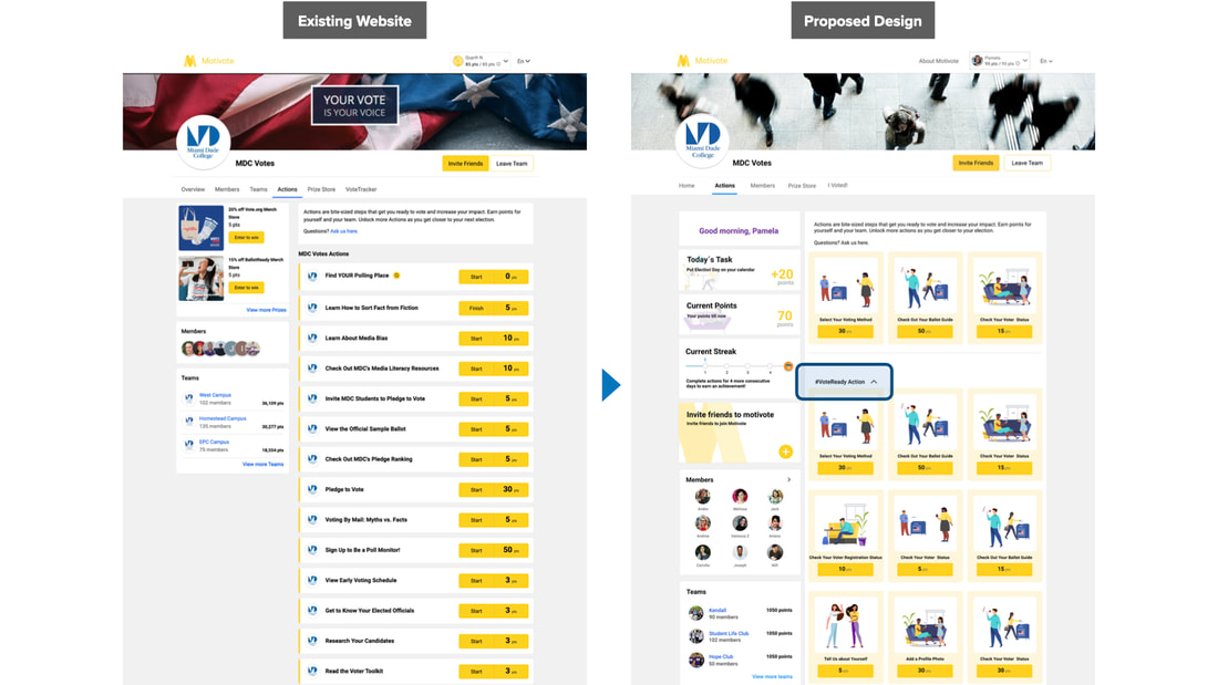
Here on action page, the layout was overwhelming and it was difficult to reaching options after long scrolling. we put Actions that are critical to the voting process right on top so that voters can instantly see them without having to scroll down, We also Changed the layout for each action from being a list to a card to make it intuitive and easier for voters to see the individual action also added illustrations to make it more fun!
We also added a chevron dropdown button to allowing the voters to control the actions they want to see.
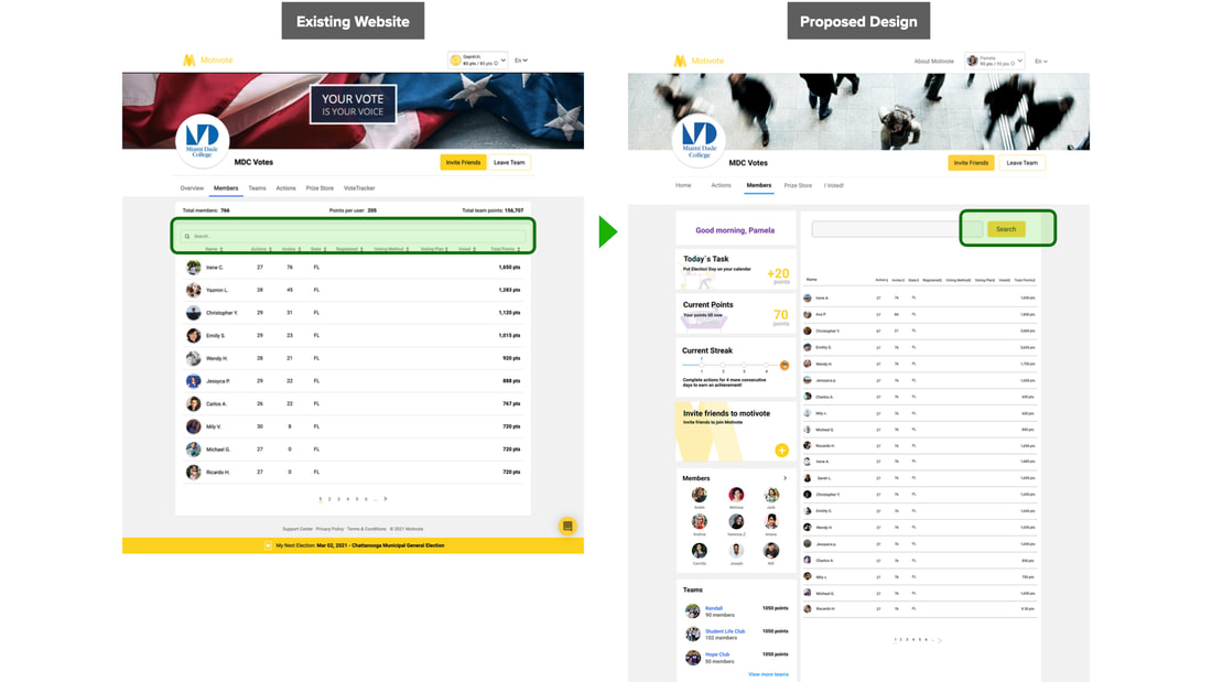
For the member page the search bar was not recognizable, we added the search button to ease the search experience for voters. We also added a clear sort bar to make it easier for voters to filter through members and Implemented a voter profile card to allow members to see each others achievements.
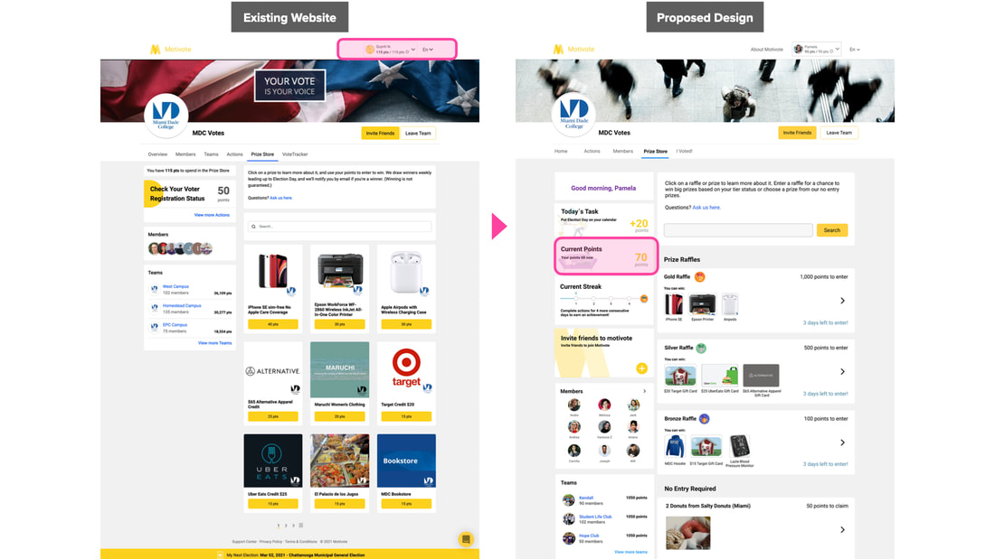
In prize store page, in the existing design users were not able to find their current points to know which prize to redeem. we added the current point on the sidebar so they can keep track of their points.
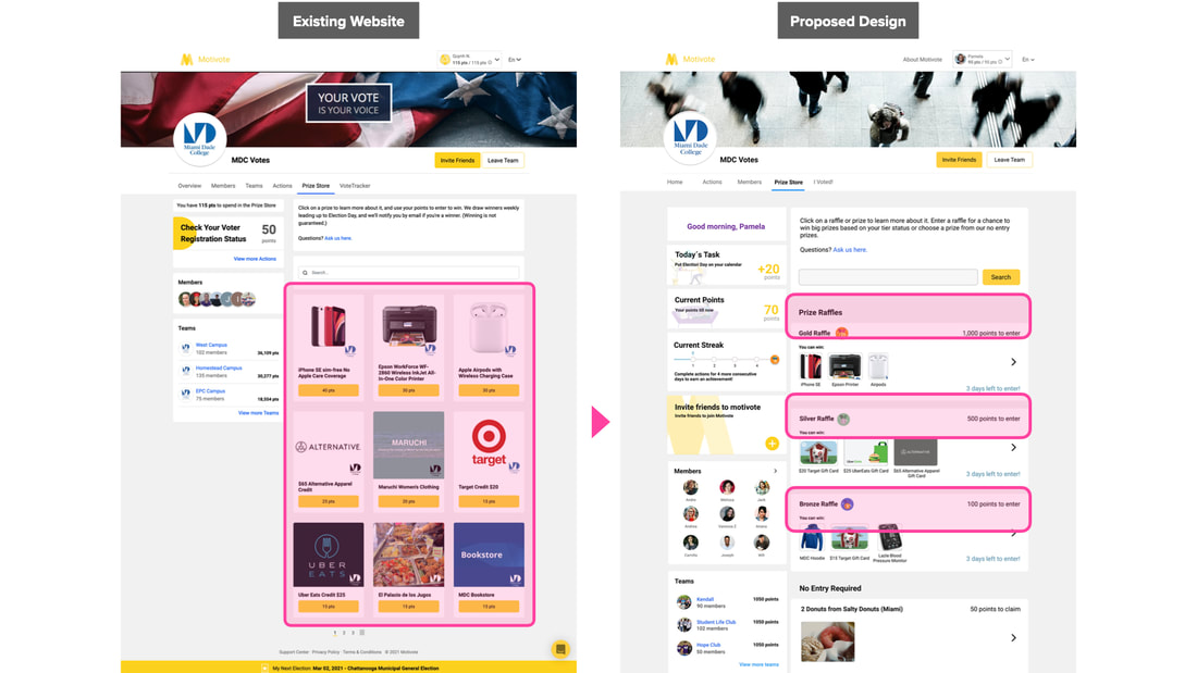
We also Created new categories for prizes named them gold, silver and bronze to keep voters motivated.
We changed the placement of the illustration from the left to the center in order to make it match with the visual of the gallery.
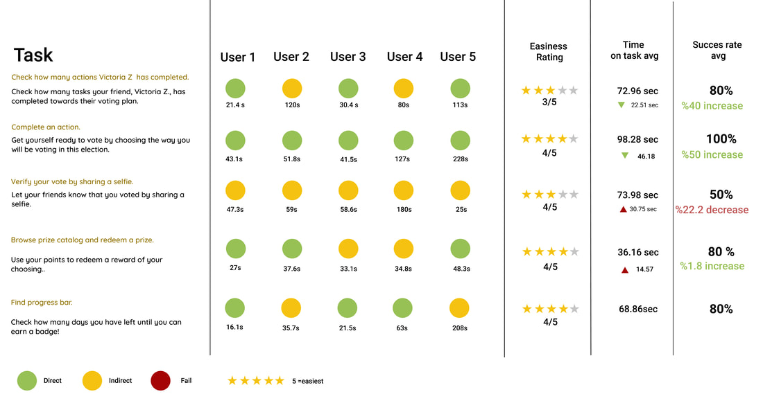
Based on the proposed design we ran another round of usability testing, you can see the result of the score card:
Comparing to the final round of usability testing with the existing website, there is an improvement in general in terms of directness of performing the task, except the third task which was about sharing the selfie. The reason was that participants assumed they could post their selfie on the feed on the homepage due to the photo iconWe also had decrease in terms of time on performing the task, except the third for the same reason and forth tasks because participants wanted to check their points first, but then immediately went to claim the prize afterwards and it took longer time for them.
Reflect
The results from our data show that we are heading in the right direction. There a few recommendations that we have before the hand off to developers.
- on the dashboard to reinforce changes to the name of the categories, we suggest conducting a tree testing
- Although we moved the filter on the members list page, we recommend changing the layout and the visual of the list
- on the side bar to make it easier to find, we suggest changing the position of streak bar
- our last recommendation is to change the picture icon on our feed to an icon that represents uploading an article


