Your Budget, Made Simple!
|
Save App is a smart, simple, comprehensive budgeting tool that allows users to easily monitor their finances while giving actionable advice for monetary improvement, in this project We want to understand the systems, or lack thereof, that people use to handle their financial planning.
|
Product:
Mobile App My Role: User researcher Interaction designer Team: Linda Virtue Andre Williams Duration: 14 days |
In order to examine how they engage this problem space, we created criteria and screened for five users in an interview. We developed a discussion guide and asked generative questions on the subject. The information they shared was synthesized into insights. We then created a user journey to visualize pain points, highlights and most importantly, opportunities for improvement.
After this research stage, we transitioned to design, using feature prioritization method. We implemented a matrix as well as a MoSCoW Map before going to Design Studio where we created our first rough wireframes. Then we went to mid fidelity wireframes which we used to do the first round of user testing. Based on our takeaways, we created a revised hi fidelity prototype and conducted our second round of testing. This led us to our conclusion.
We learned that people lack a comprehensive financial tool that allows them to efficiently view and manage their money. We also learned that while there are many tools to managing different aspects of their finances, there isn’t one congruent place where all their data is easily at hand. Our final takeaways is that we are offering users a useful tool but the design requires further iteration to
improve functionality.
Hypothesis
“Users lack of budgeting creates a lack of financial awareness and control.”
Assumptions
Initial Problem Statement
“How might we create a comprehensive tool that provides all important aspects to money management enabling people to meet their financial goals and needs efficiently?”
After this research stage, we transitioned to design, using feature prioritization method. We implemented a matrix as well as a MoSCoW Map before going to Design Studio where we created our first rough wireframes. Then we went to mid fidelity wireframes which we used to do the first round of user testing. Based on our takeaways, we created a revised hi fidelity prototype and conducted our second round of testing. This led us to our conclusion.
We learned that people lack a comprehensive financial tool that allows them to efficiently view and manage their money. We also learned that while there are many tools to managing different aspects of their finances, there isn’t one congruent place where all their data is easily at hand. Our final takeaways is that we are offering users a useful tool but the design requires further iteration to
improve functionality.
Hypothesis
“Users lack of budgeting creates a lack of financial awareness and control.”
Assumptions
- People do not have a systematic way of budgeting.
- People can’t keep track of their short-term and long-term expenses.
- People don’t have a clear idea of what their overall financial responsibilities are.
Initial Problem Statement
“How might we create a comprehensive tool that provides all important aspects to money management enabling people to meet their financial goals and needs efficiently?”
In order to understand how people budget, it was necessary to locate participants who represent our target audience and were
demographically balanced. We created a survey that would find the right people, to provide relevant responses to our problem space. We found participants using personal contacts and social networks. 22 people completed our survey, 75% of which were
between the ages of 26 to 39. 5 of these participants were selected for the interview process.
Developing a discussion guide was essential to creating generative and useful data for our research. We needed knowledge on how people managed their money. We hoped to gain insight into their pain points, goals and methods. Being mindful in crafting each question, helped us avoid biased and leading questions. Predicting possible responses to our questions helped focused our need to discover insights.
With our discussion guides completed, we conducted a test run to double-check the fluidity of our questioning. We then proceeded into interviewing our five users.
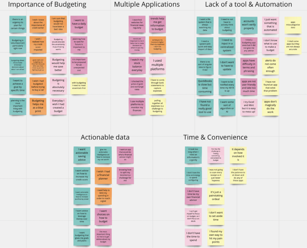
Once we completed the user interviews, we used the Affinity Mapping method which isolated key themes representing
users pain points, goals, methods and needs. By grouping key findings based on reoccurring themes, we able to visualize
prioritize the users wants and needs. By the end of this process, we discovered five key trends:
- Users found great value in managing their money and viewed it as essential.
- Users were frustrated around having to jump between many sites and inability to have a singular view of their financial profile.
- Users wanted one system that answered all their needs.
- Users wanted a system that allowed an automation of their data.
- Users desired actionable information in order to achieve their financial goals
Insights
- Users want to see that their budgeting is paying off
- Users need actionable advice to reach their goals
- Users want to see all actionable advice to reach their goals
- Users need a tool that can be customized to their needs
Persona
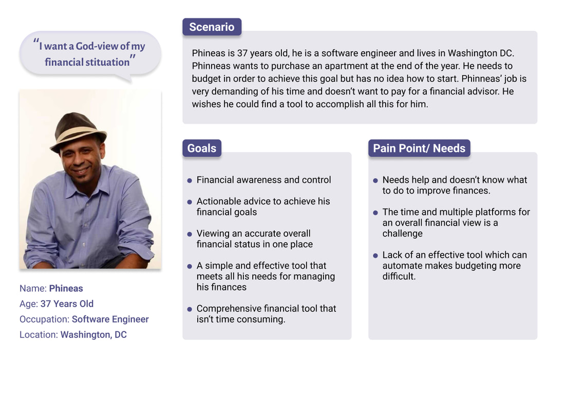
To summarize our research and create a unilateral understanding of our target audience, we developed a persona. This enabled us to focus our efforts in solving problems based on the user. Creating a persona also builds user empathy. We identified shared characteristics, demographics, goals and pain points. With all these elements taken into consideration, meet “Phinneas” and he needs to budget in order to purchase a new apartment.
User Journey Map
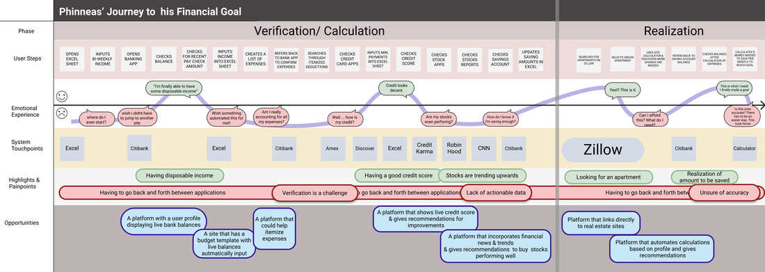
Journey Mapping helped us to visualize Phinneas’ process of budgeting in order to save enough money to purchase an apartment. It covers every step he would take, detailing his emotional ups and downs. This map also brings attention to the pain points and highlights he encounters. We noted opportunities for recommendations to address some of the problems in the process.
After completing the research, we found that we had validated our initial hypothesis of creating a tool that helps users meet their financial goals efficiently. But we can still revise our problem statement to reflect the additional insights we found through our research process. We found that users also needed actionable advice to meeting their goals. By actionable advice, we mean recommendations and options, based on their current financial status, to meet short and long term goals. In the case of Phinneas, he wants to purchase a new apartment. Actionable advice would greatly help him in reaching his goal. Providing him with recommendations and multiple paths to his goal, Phinneas feels in control of his finances.
Our revised problem statement ask...
“How might we provide users with a comprehensive budgeting tool, that saves users time and provides actionable advice?”
Our revised problem statement ask...
“How might we provide users with a comprehensive budgeting tool, that saves users time and provides actionable advice?”
Feature Prioritization
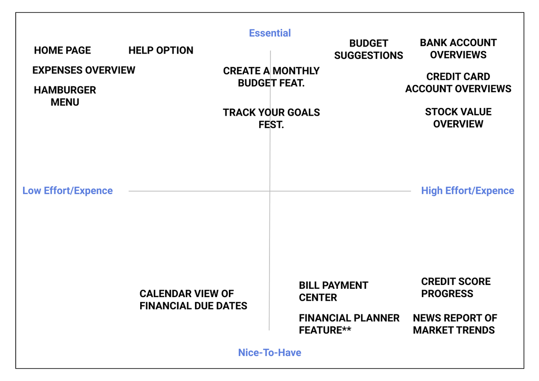
We use feature prioritization to reveal the importance and the order of which features the team works on. Because we have limited time and resources, figuring out which features to develop first is necessary. We used two methods of feature prioritization, Feature Prioritization Matrix and the MoSCoW Method.
- Using the matrix, we found out which features are essential and take the least amount of effort to develop.
- The MoSCoW map shows the order in which we need to work on these features.
Insights
We found that the most essential and took the least effort to make component of this application were: Home page, Help option, expenses Overview and Hamburger Menu. We also found that Bank Account overviews, Credit card overviews, budget suggestions and stock value are essential features but could require high effort and expense. We also believe that Calendar views of due dates, Bill payment Center, Credit Score Progress, Financial Planner feature and News & Trends would be nice to have but were high effort and not necessarily core to our users.
MoSCow Map
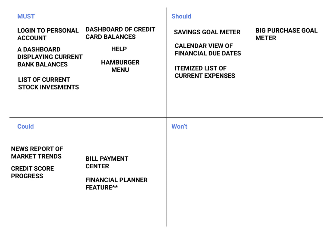
We found that we should prioritize time to first develop the following:
Log in, Dashboard Displaying bank balances,Credit card balances, Help, Hamburger menus(user’s profile) & List of current stock investments. Next we would focus time on the savings goal meter, Calendar views of due dates, Itemized expenses and big goal meters. Lastly we would work on News reports/Trends, Credit monitoring, bill payment options and financial planning features.
Log in, Dashboard Displaying bank balances,Credit card balances, Help, Hamburger menus(user’s profile) & List of current stock investments. Next we would focus time on the savings goal meter, Calendar views of due dates, Itemized expenses and big goal meters. Lastly we would work on News reports/Trends, Credit monitoring, bill payment options and financial planning features.
Design Studio
We wanted to design a solution that solved the persona’s problem, while generating ideas quickly. Using this collaborative process enabled us to include all ideas.
We started by defining the problem according to our persona’s goals. All team members then sketched their ideas of a visual solution. Everyone had a chance to pitch and was critiqued. We then iterated, converging the best ideas into a final sketch which we refined together.
We started by defining the problem according to our persona’s goals. All team members then sketched their ideas of a visual solution. Everyone had a chance to pitch and was critiqued. We then iterated, converging the best ideas into a final sketch which we refined together.
Mid-Fidelity Mobile
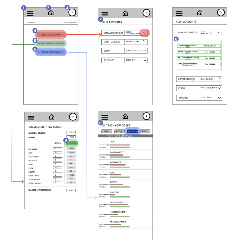
We created a digitized mid- fidelity prototype in Figma. Absent of colors and branding, this prototype allowed us to simulate basic functionality for users to test our application. Below is the wireframe of how we expected participants to navigate through prototype. We also included annotations of important features.
- The Hamburger Menu contains basic profile settings such as set up details, security informations, sign in preferences and other account settings.
- Home Icon, allows users to always get back to homepage and is consistent across all frames.
- Help, user can always go there for trouble shooting advice.
- See All Accounts, a core feature, this leads user to have a complete view of all their active accounts.
- Create a Monthly Budget, core feature that leads user to create budget
- Track Your goals, core feature that leads user to see progress with their goals
- Your Accounts, this feature is solely dedicated to viewing all active accounts
- Dropdown, this is a detailed view of all bank accounts
- Use Our Suggestions, this is an optional smart feature with an element of automation to assist user in budgeting
- Track your Goals, this feature allows user to see their progress in relation to their set goals for each of their budgeting categories.
Usability Testing
Directly from the user’s perspective, usability testing enabled us to understand if our design operated efficiently and solves
the users problem. We gained insight into the pain points while using our app. We learned where and why problems occurred, we also received recommendations from users for improving the problem areas. It also provided us with quantitative data which should help us to see how we improve in our next iteration.
the users problem. We gained insight into the pain points while using our app. We learned where and why problems occurred, we also received recommendations from users for improving the problem areas. It also provided us with quantitative data which should help us to see how we improve in our next iteration.
Hi-Fidelity Mobile Wireframes
We created a hi-fidelity prototype to test users on a model more similar to what they would encounter in the real world.
It included revisions which came from our last round of testing to improve functionality. In addition we added elements to
provide more context and actionable data.
It included revisions which came from our last round of testing to improve functionality. In addition we added elements to
provide more context and actionable data.
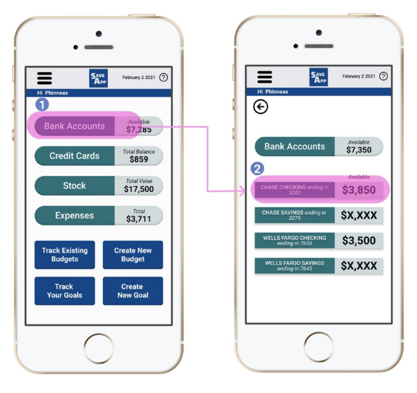
- Home page & Dashboard, user can see all active accounts.
- User can select and view any account in detail.
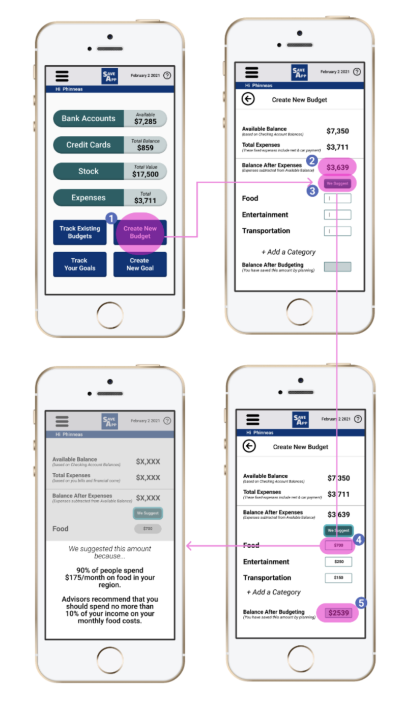
- This is a call to action Button for the user to create a new budget.
- The balance after expenses feature allows the user to see how much they have leftover after their fixed expenses have been deducted.
- We suggest, gives a recommendation to the user for limits on how much they spend for categories which are variable.
- When user hovers over, any suggested amount, a pop up will give them context on how the app has formulated recommended amounts. It includes smart budgeting tips
- Once user has completed their budget, this balance after budgeting feature let them see the total balance left over
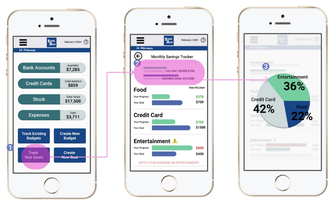
- This is a call to action Button for the user to Track their goal
- This page gives the user a view of their overall savings goal and their progress towards it. It further breaks down each category showing progress in savings in each of these variables
- When user hovers over View pie chart, they will see this optional view. It will give them a quick visual spending analysis.
Usability Testing & Findings - Round 2
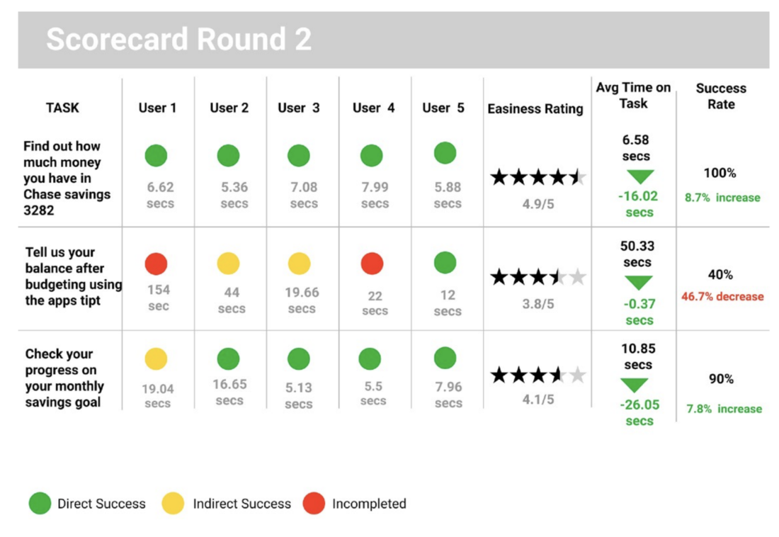
Directly from the user’s perspective, this second round of usability testing enabled us to understand if our design operated efficiently and solved the users problem. We gained insight into the pain points while using our app. We learned where and why problems occurred, we also received recommendations from users for improving the problem areas. It also provided us with quantitative data which should help us to see how we improve in our next iteration.
After the second round of usability test, we understand that our design gave the users some challenges. We recommend
changing the following:
changing the following:
- We suggest increasing the size of the “We Suggest” call to action buttons. We found that users could not locate this key feature. Also, we recommend adding a signifier to using the “We Suggest” button .
- We need to adjust size in accordance to the priority of the information. For instance, in the monthly saving tracker page, user’s goals needs to be emphasized in size while the categories should be reduced.
- We need to rethink the taxonomy of certain phrases to improve clarity. For example users did not understand the “We Suggest” action button.
- We need to add a signifier for the additional feature on the page which explains how we come up with suggestions.
- Finally we recommend another round of usability testing.


